


Starting a React Component Library at unfoldingWord


Manny Colon
Jul 31, 2020·6 min read

unfoldingWord React Component Libraries
What?
As Christopher Klapp describes in unfoldingWord Component Libraries, A Component Library is a collection of functionally related Components.
A React Component Library (RCL) is a great way to reuse code, speed up development and maintain a consistent UI/UX across different features and applications.
Why?
You can read more about the reason behind unfoldingWord’s RCL approach here. However, in a nutshell, we use RCLs because our software development process gains code reusability, abstraction, collaboration, and versatility.
How?
Next …
Getting started
Create a project directory and initialize the NPM package:
mkdir sample-react-component-library
cd sample-react-component-library
yarn init -yor
npm init -y
Adding core dependencies
Let’s run the following command to install the core dependencies:
yarn add --dev react react-dom prop-types @material-ui/core
As a side note, I useyarnon this project but feel free to usenpmif you prefer. However, if you want to use yarn like me and don’t have it installed on your machine, feel free to check out the following link on how to install yarn.
2 - Installation
We’ve been compiling helpful advice when porting over from Yarn 1 on the following Migration Guide. Give it a look and…
yarnpkg.com
Make the core dependencies peerDependencies so that npm/yarn knows about the compatibility of our dependencies. This will help prevent them from being included in the final bundled published to NPM. Bundling React into your library is a bad idea, you certainly don’t want a bloated RCL (React Component Library). The more lightweight you can keep it the better.
Now, manually add peerDependenciesusing the major versions of the libraries.
package.json
Setting up live development with Styleguidist
We use Styleguidist as a component development environment with live reloading and a documentation playground to showcase our components’ APIs.
Styleguidist is an isolated React component development environment with a living style guide. It allows developers to focus on one component at a time, see all its variants and work faster with hot reload.
Check out Styleguidis’s website to learn more:
React Styleguidist: Isolated React component development environment with a living style guide
Isolated React component development environment with a living style guide
Isolated React component development environment with a living style guidereact-styleguidist.js.org
Install Styleguidist and Webpack:
For more information on how to set up Styleguidist see the Styleguidist Getting started section.
yarn add --dev react-styleguidist webpack
Setup Babel
We need to set up Babel in order to transpile our code and make it work well with Styleguidist.
The entire process to set this up involves:
1. Running these commands to install the packages:
yarn add --dev babel-loader @babel/core @babel/cli @babel/preset-env @babel/preset-react
2. Creating a config file named babel.config.json in the root of your project with this content:
babel.config.json
Connect Styleguidist with Babel
Now set up Styleguidist’s internal webpack instance to use our Babel config to load the components properly. Thus, create styleguide.config.js with this content:
styleguide.config.js
We’re ready to launch the Development environment!
Add the following command ”start”: “styleguidist server” to your package.json and run yarn start.
package.json
Open http://localhost:6060 and you should see the following:
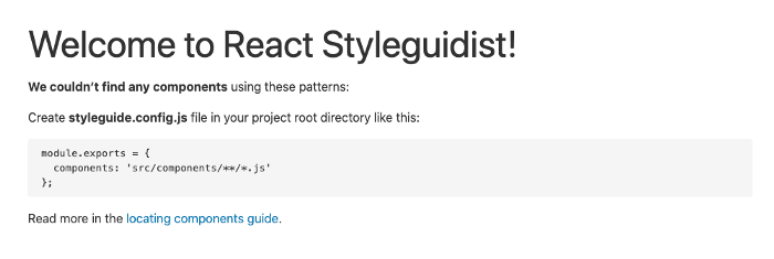
Of course, we have not created any components yet, let’s do that now…
Creating Components
We have set up the React Component Library development environment, now let’s create some components.
All components will be added to the src/components directory.
The component file structure will be as follows:
src/
└── components/
    └── Button
        ├── index.js
        └── Button.js
Let’s start with a basic button.
Copy the following code to src/components/Button/index.js:
index.js
Copy the following code to src/components/Button/Button.js:
Button.js
Run yarn start or npm start again to restart the Styleguidist server.
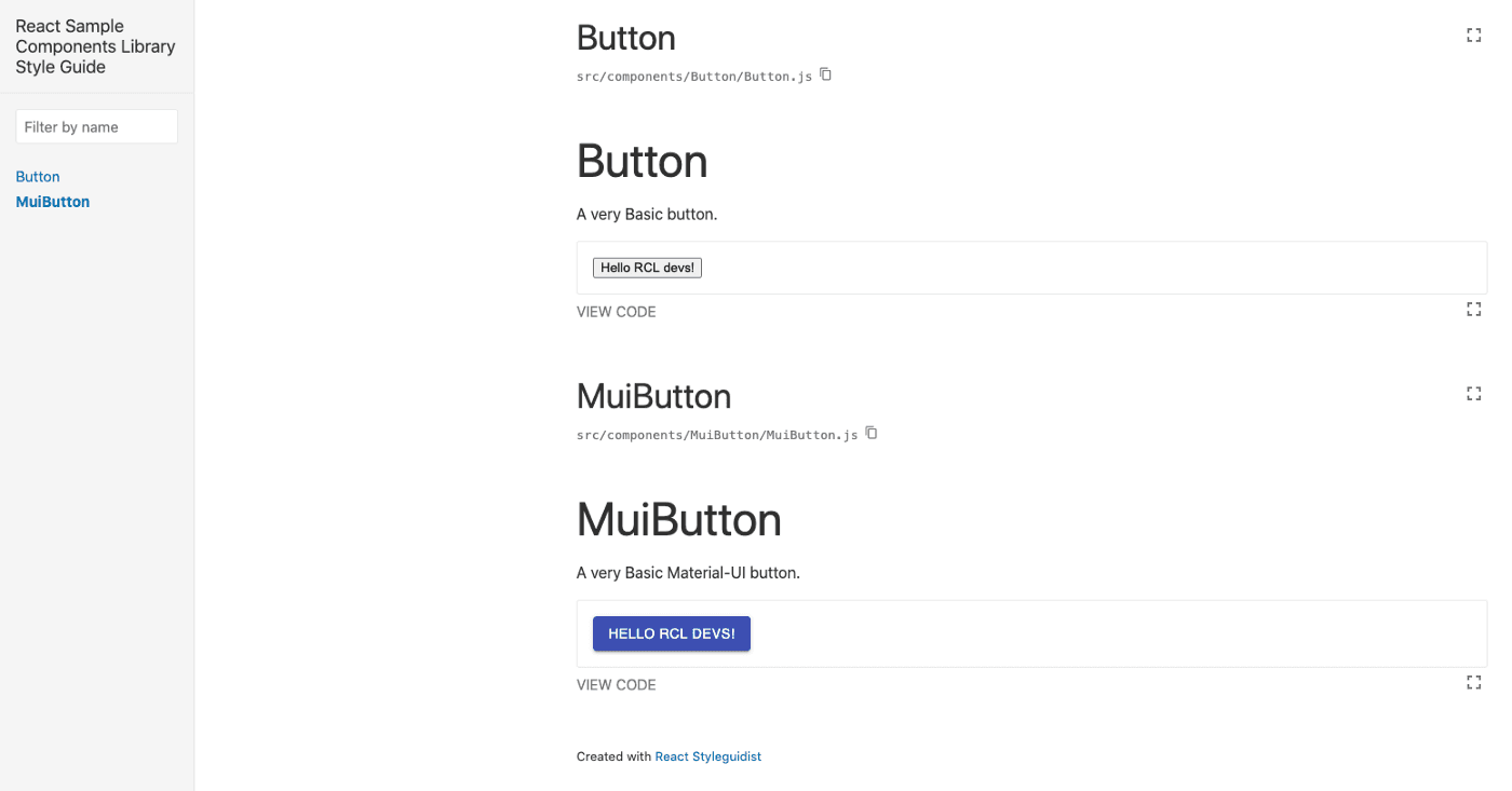
Now, open http://localhost:6060 again and it should include the Button Component in the docs as shown in the picture below.
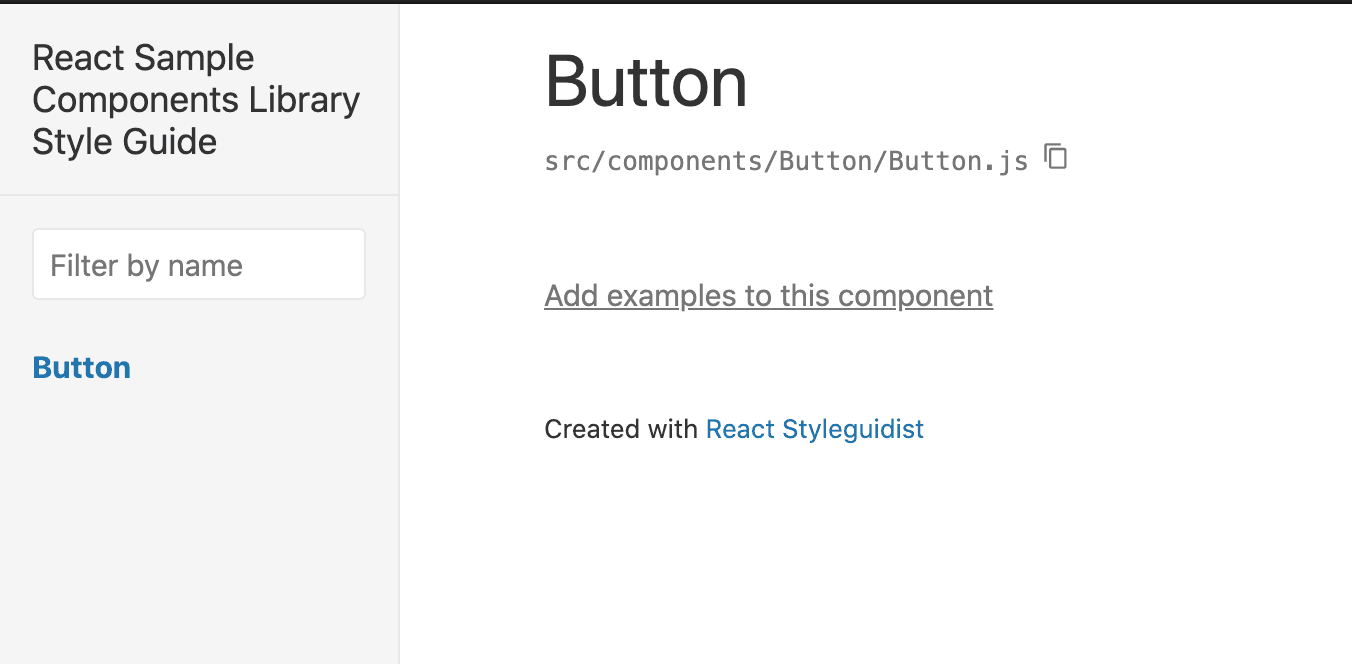
It doesn’t really show anything yet, but Styleguidist makes it easy to preview and describe the components.
Now create a markdown file named Button.md inside the Button folder to start documenting the Button Component.
src/components/Button/Button.md
We can mix Markdown with JavaScript/React code to show the examples and descriptions easily.
Now restart the Styleguidist server by rerunning yarn start or npm start and refresh the page, we should now see:
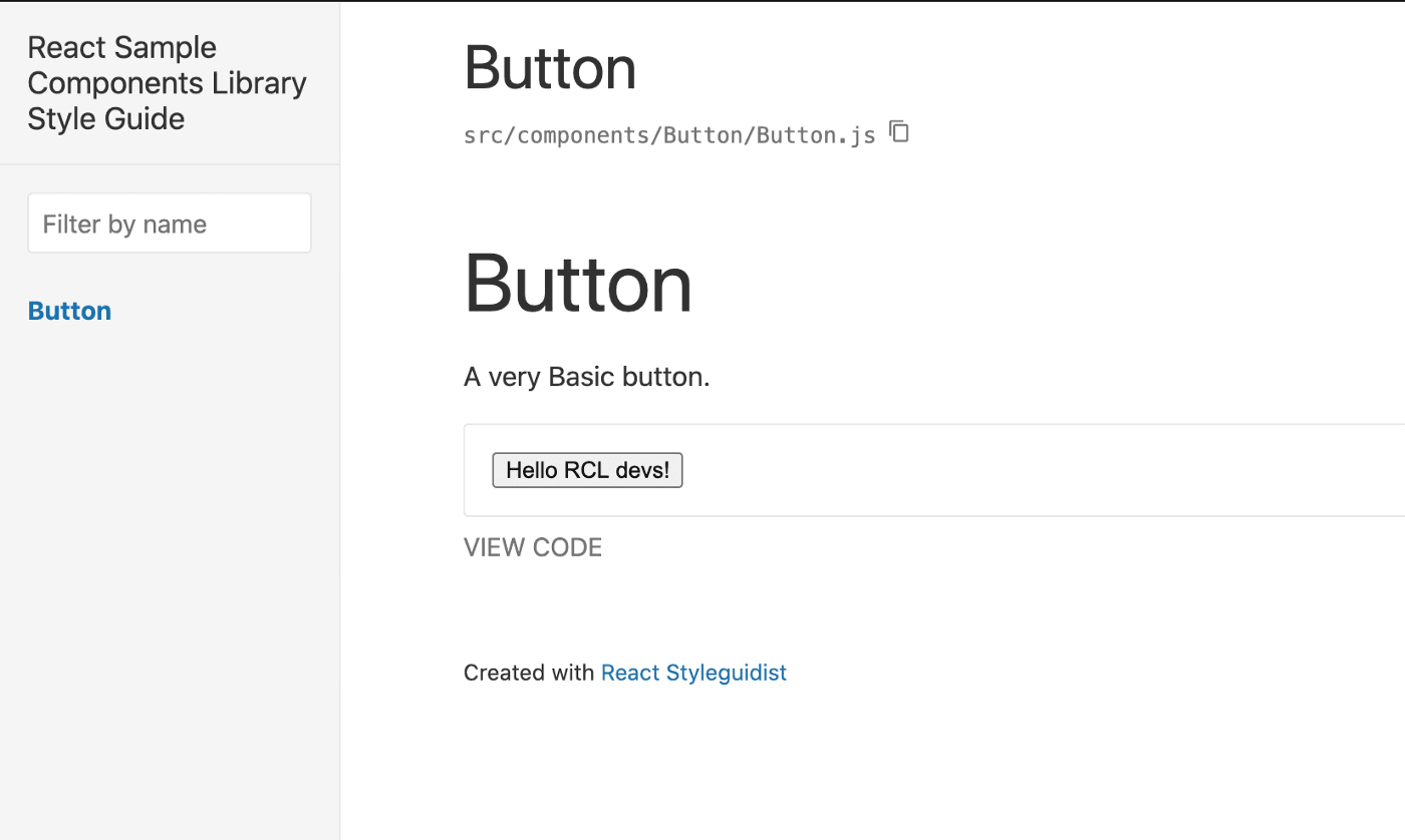
We have created our first basic component, have set up a development environment with live preview, and production-ready documentation at the same time.
Material-UI + unfoldingWord RCLs
At unfoldingWord we use Material-UI with our RCLs as a baseline for our UI/UX design.
Let’s start with a basic button using the Material-UI library.
Copy the following code to src/components/MuiButton/index.js:
index.js
Copy the following code to src/components/MuiButton/MuiButton.js:
MuiButton.js
Restart the Styleguidist server running yarn start or npm start again.
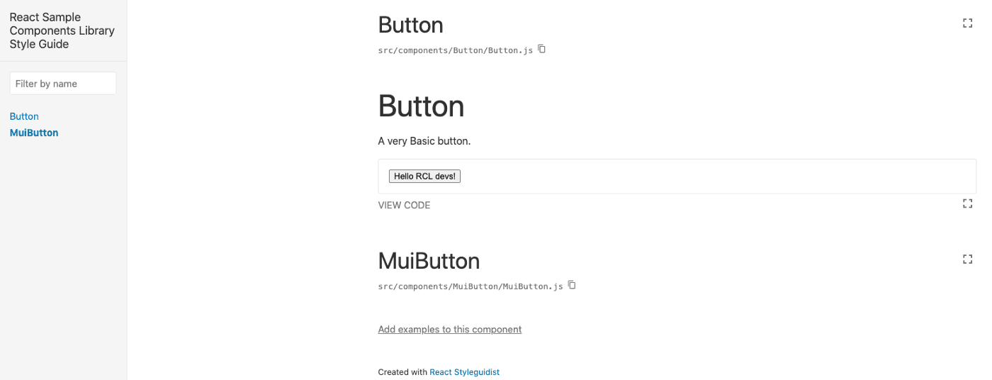
Open http://localhost:6060 and you should see the MuiButton Component.
Finally, let’s create a markdown file either named MuiButton.md or README.md inside the MuiButton folder to start documenting the MuiButton Component.
Restart the Styleguidist server. You should now see the MuiButton component in the Styleguidist live demo.
Bundling and publishing to NPM
Make sure you have an NPM account beforehand, if you don’t make sure to sign up here.
First, we have to update the entry point to the library. In order to do that, we have to update the main field in package.json. This points to the bundled file that will be generated, not to the sources.
Let’s set it to dist/index.js, the path to the bundled output.
package.json
We’re missing one more file, which defines what is exported from the library and what users can import. Create a src/index.js file with the following code:
Also, create a src/components/index.js file and add all current components to make sure they’re exported and made available to users of our RCL, here we’ll also export new components as we create them.
src/index.js and dist/index.js, are respectively the input and output files for the bundler.
Before publishing let’s make sure we don’t publish unnecessary files to our NPM module, so let’s add a .npmignore file to the root of our project.
.npmignore
Now let’s bundle the code and publish it to NPM…
The following command compiles your code from the src directory to dist
./node_modules/.bin/babel src --out-dir dist
You can use the npm package runner that comes with npm@5.2.0 to shorten that command by replacing./node_modules/.bin/babelwithnpx babelor justnpm babelshould do the work.
Accordingly, add the following command prepublishOnly: “rm -rf ./dist && babel ./src --out-dir ./dist -s inline” to package.json this makes sure to bundle the code before publishing it to NPM.
For Windows users, if there is a problem with
rm -rfthen you need to add therimrafpackage and replacerm -rfwithrimrafin the command above.
Your scripts field should look like this:
package.json
Run yarn publish or npm publish to bundle the code and publish it to NPM. Of course, if you use the same name as I did the publish will fail because there is already a module with that name on NPM, so feel free to change the name of your RCL on your package.json file.
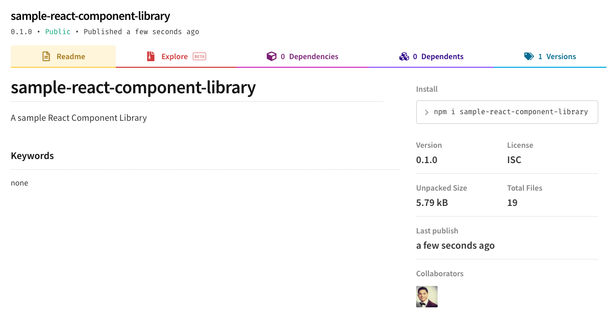
After publishing, let’s test our library, I created a React app on codesandbox and installed our newly published RCL. Let’s check it out:
As you may remember, we included @material-ui/core in the peerDependencies list. Therefore, our app must include it as a dependency.
After adding @material-ui/core as a dependency on our app, we have both button components rendering correctly from our newly created RCL.
Click on the “Open Sandbox” button above if you want to open the sandbox project I used to try out the RCL we just created.
Feel free to check out the following repository if you need help:
GitHub - mannycolon/first-react-component-library-tutorial
Contribute to mannycolon/first-react-component-library-tutorial development by creating an account on GitHub.
github.com
Happy coding!